
Master the Art of Combo Charts in Excel - A Simple Tutorial for Visual Data Analysis

Master the Art of Combo Charts in Excel - A Simple Tutorial for Visual Data Analysis
Quick Links
- Insert a Combo Chart with a Single Axis
- Insert a Combo Chart with Two Axes
- Change an Existing Chart to a Combo Chart
A combo chart in Excel displays two chart types (such as column and line) on the same chart. They are used to show different types of information on a single chart, such as actuals against a target.
In this article, we’ll demonstrate how to make a combo chart that follows the same axis and one that displays mixed types of data in a single chart on a different axis.
Insert a Combo Chart with a Single Axis
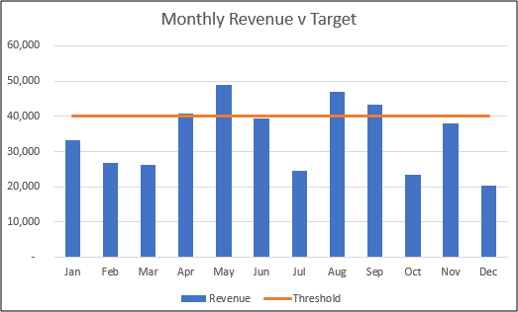
In the first example, we will create a combo chart to show monthly revenue against a target using the sample data below.
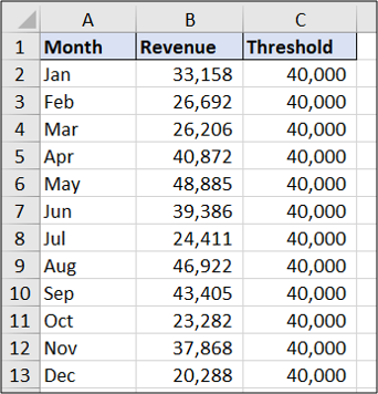
You can see that the target value is the same each month. The result will show the data as a straight line.
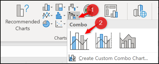
To get started, select the range of cells you want to chart—A1:C13 in this example. Next, click Insert > Insert Combo Chart. Select “Clustered Column - Line.”
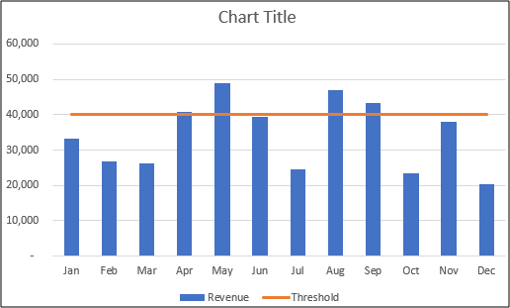
The combo chart is inserted with both the column and line using the same axis. Easy as that!
You can make further improvements to the chart now, like changing the chart title. Click on the chart title box and start typing to replace the words “Chart Title” with something more useful. As you type, the text will appear in the formula bar above.
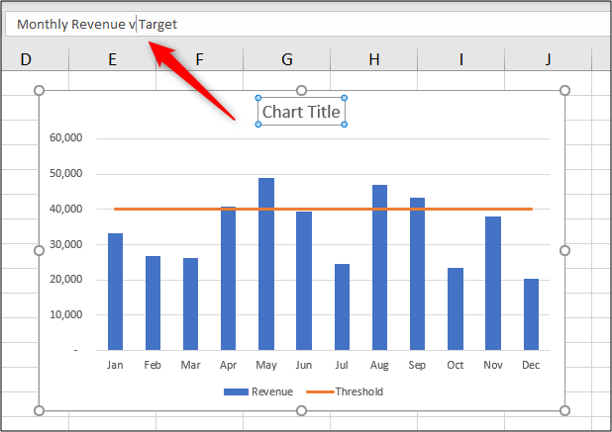
Press the Enter key, and Excel saves the typed text as the chart title.
Insert a Combo Chart with Two Axes
Using the sample data shown below, let’s create a combo chart to show the monthly revenue and the ad budget on the same chart.
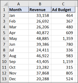
Select range A1:C13. Click Insert > Combo Chart. Choose the “Clustered Column - Line on Secondary Axis” chart.
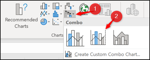
The inserted chart looks like this.

Change an Existing Chart to a Combo Chart
We have looked at two examples of creating a combo chart from spreadsheet data, but knowing how to edit an existing chart can also be useful.
Below is a clustered column chart created from the revenue and ad budget data.
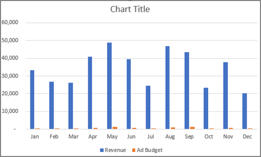
The chart has one axis, and you can barely see the ad budget columns on the chart. Let’s change this to a combo chart by creating a secondary axis for the ad budget data and changing its chart type to a line.
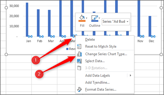
To begin, right-click on the data series you want to change (ad budget in this example). Next, select “Change Series Chart Type.”
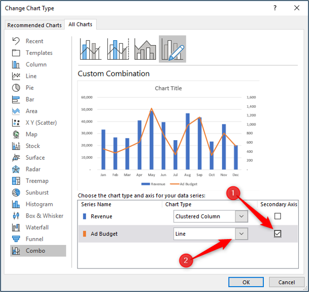
Now, check the “Secondary Axis” box for the data series you want to create an axis for. Select Line from the “Chart Type” list for that data series.
The chart is changed to a combo chart.
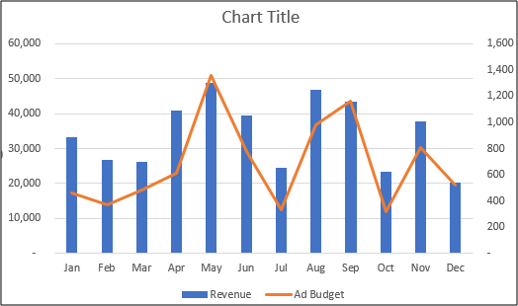
You can then make other improvements to the combo chart, such as editing the chart title or labeling the axis.
Also read:
- [New] Expert-Level Workshop Programming Timer Functions for OBS Productions for 2024
- [Updated] 2024 Approved TikTok Streams Decoded Finding Your Special Hashtag
- [Updated] FB Videos Made Quick Proximity Tricks for Instant Upload/Download
- [Updated] In 2024, How to Make a Group Chat on Skype [For Windows and Mac]
- 2024 Approved GoPro Hero5 Vs. Yi 4K The Ultimate Showdown in Cam Tech
- Efficiently Manage Your Samsung Printer on Windows with Our Step-by-Step Driver Installation Guide and Download Links
- Game on Windows: Secure Your Logitech G Pro Gamepad Driver From Our Official Site
- How to Ensure Compatibility: Fresh Driver Downloads for the Dell USB-C (Thunderbolt) Expansion Cradle TB16
- How to Rotate Your Upside Down and Sideway Photos on iPhone
- In 2024, How to Access Your Apple iPhone SE (2022) When You Forget the Passcode? | Dr.fone
- Killer E2500 Gigabit Ethernet Driver Download - Latest Version Available
- Latest Updates for HP LaserJet Pro M404n - Get Your Printer Software Now!
- Speedy Connection - Direct Links to Downloading Your Thrustmaster T150 Gamepad Drivers
- Title: Master the Art of Combo Charts in Excel - A Simple Tutorial for Visual Data Analysis
- Author: David
- Created at : 2024-10-13 16:01:24
- Updated at : 2024-10-20 17:32:19
- Link: https://win-dash.techidaily.com/master-the-art-of-combo-charts-in-excel-a-simple-tutorial-for-visual-data-analysis/
- License: This work is licensed under CC BY-NC-SA 4.0.