
Effective Techniques for Merging Pie Charts in Excel: A Step-by-Step Guide

Effective Techniques for Merging Pie Charts in Excel: A Step-by-Step Guide
Quick Links
- Consolidate Data from Multiple Charts
- Combine Pie Chart into a Single Figure
- Choose Different Charts to View your Data
Pie charts are popular in Excel, but they are limited. You’ll have to decide for yourself between using multiple pie charts or giving up some flexibility in favor of readability by combining them. If you do want to combine them, here’s how.
For example, the pie chart below shows the answers of people to a question.
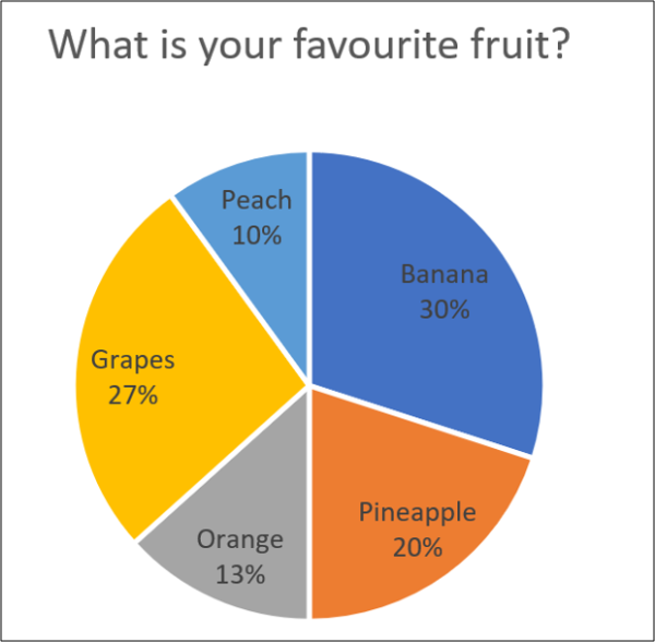
This is fine, but it can be complicated if you have multiple Pie charts.
Pie charts can only show one series of values. So if you have multiple series, and you want to present data with pie charts, you need multiple pie charts.
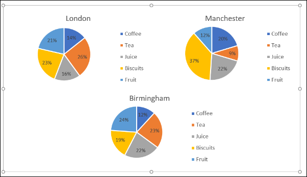
The image below shows the contribution to total revenues of five products across three different cities. We have a pie chart for each city with the data ranges shown above them.
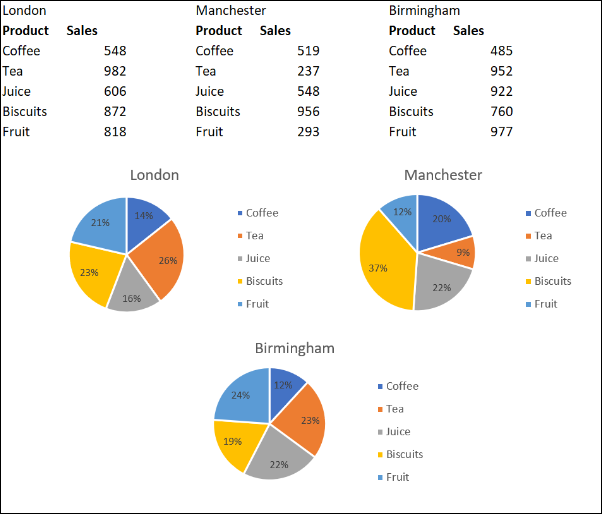
This enables us to compare the sales of products across different cities. But there are complications when we want to change them all consistently, or view them as a single figure.
In this article, we will look at three different approaches to combine the pie charts.
Consolidate Data from Multiple Charts
The first approach looks at combining the data used by the pie charts.
It makes sense to show one pie chart instead of three. This would create more space on the report and mean less ‘eye tennis’ from the reader.
In this example, it will come at the sacrifice of the city comparison though.
The easiest and quickest way to combine the data from the three pie charts is to use the Consolidate tool in Excel.
Let’s consolidate the data shown below.

Click a cell on the sheet where you the consolidated data to be placed. Click Data > Consolidate on the Ribbon.
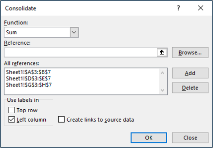
The Consolidate window opens.
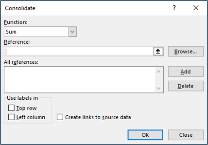
We’ll use the Sum function to total the sales from all three cities.
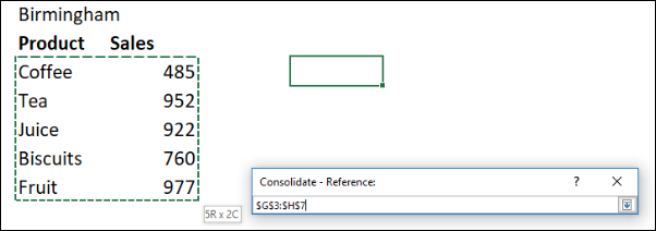
Next, we have to gather all of the references which we want to consolidate. Click in the “Reference” box, select the first range, and then click “Add.”
Repeat this step for the other references.
Check the “Left column” box as the name of the product is to the left of the values in our data. Click “OK.”
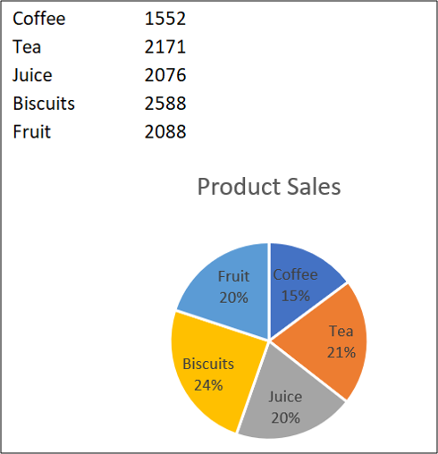
We now have a consolidated range from which to create our pie chart.
This pie chart makes it easier to see the contribution of each product type to the total revenue, but we lose the comparison between each city that we had with three different charts.
Combine Pie Chart into a Single Figure
Another reason that you may want to combine the pie charts is so that you can move and resize them as one.
Click on the first chart and then hold the Ctrl key as you click on each of the other charts to select them all.
Click Format > Group > Group.

All pie charts are now combined as one figure. They will move and resize as one image.
Choose Different Charts to View your Data
Although this article is about combining pie charts, another option would be to opt for a different chart type. Pie charts are not the only way to visualize parts of a whole.
A good alternative would be the stacked column chart.
Take the example data below. This is the data used in this article but now combined into one table.
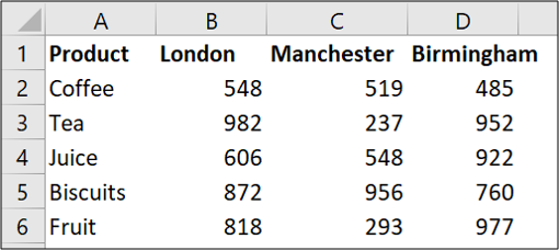
Select the range of cells and click Insert > Column chart.
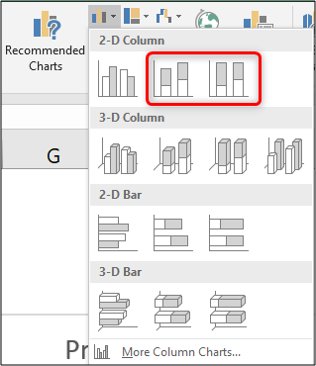
There are two types of Stacked Column to choose from. The first one will present your data as below.
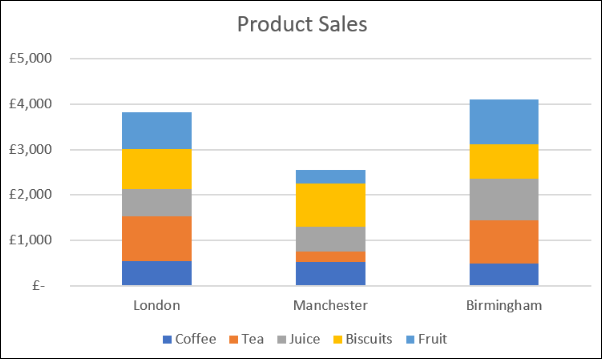
This is like having three pie charts in one chart.
It does an excellent job of both showing the contribution of values in each city, while also allowing us to compare the costs across cities.
For example, we can see that Manchester produced the lowest revenue and that sales of tea and fruit were low compared to the other stores.
The second Stacked Column chart option would present your data as below.
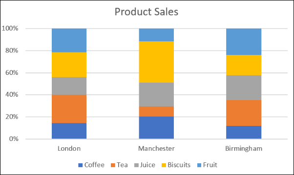
This uses a percentage in the axis.
So we lose the ability to see that Manchester produced the lowest revenue, but it can give us a better focus on the relative contribution. For example, most of the sales from the Manchester store were from biscuits.
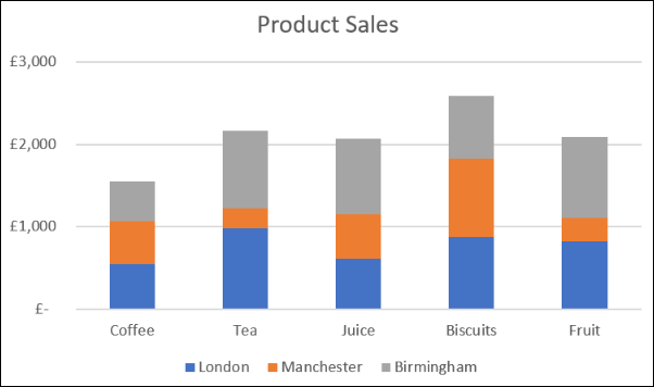
You can click the “Switch Row/Column” button on the Design tab to switch the data between the axis and the legend.
Depending on your reasons, there are different ways to combine pie charts into a single figure. This article explored three techniques as solutions to three different presentation scenarios.
Also read:
- [New] 2024 Approved Elite 6 Most Watched Shorter Video Repositories
- [New] Engagement Enhancers Trending Stories Filters for 2024
- [New] Inside Insights Proclaiming Rights to Free Clip Art Legally
- [Updated] Captivating Comedy Crafted Step-by-Step Meme Tutorial
- [Updated] Essential Enhancements for Terria Pros
- [Updated] In 2024, Craft Impressive Clips With These Intros
- [Updated] In 2024, Innovative Enhancements Stardew Valley's Top 7 Choices
- [Updated] Uncovering Average Earnings Podcaster Edition for 2024
- Complete Guide to Enhance Performance with Updated Driver Software for the Dell Thunderbolt TB18 Accessory Hub
- Easy Driver Download for Wireless Network Cards: Boost Speed Now!
- Easy Install: Epson WorkForce DS-30 Driver for Modern Windows Systems (10, 8 & 7)
- Easy Installation Guide: Logitech G430 Driver Update for Optimal Sound Experience
- Get the Latest GeForce GT 730 Driver Update for Your NVIDIA GPU Instantly
- How to Download and Update the Latest Drivers for AMD RX 6800 on Various Windows Versions
- How to Install and Update Radeon HD
- MSI GS65 Driver Upgrade Packages for Windows Available Now – Secure Your PC
- No-Cost Online Sensual Playgrounds
- Quick & Simple Way to Obtain the Newest AMD SMBus Driver Updates
- Story 3: The Confusion Around Isoleucine
- Title: Effective Techniques for Merging Pie Charts in Excel: A Step-by-Step Guide
- Author: David
- Created at : 2024-10-15 18:38:04
- Updated at : 2024-10-20 16:49:13
- Link: https://win-dash.techidaily.com/effective-techniques-for-merging-pie-charts-in-excel-a-step-by-step-guide/
- License: This work is licensed under CC BY-NC-SA 4.0.